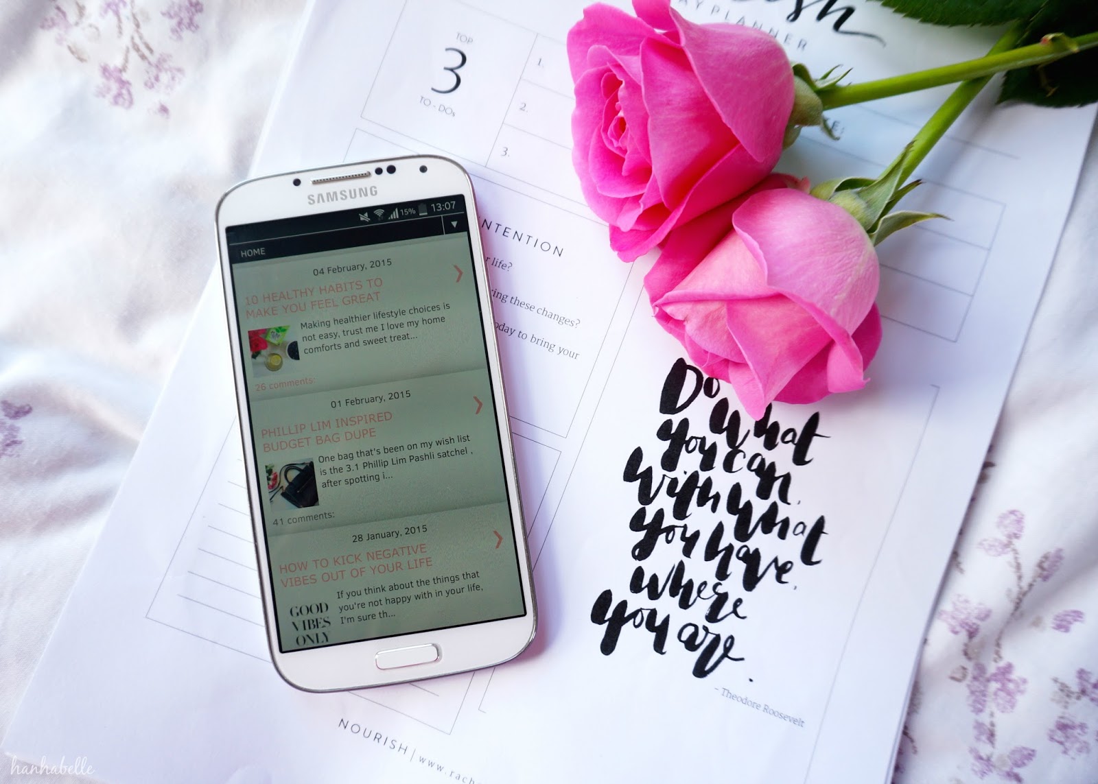
Who isn't glued to their smart phones these days? I know I'm always scrolling through my social media apps. I love Instagram and find it so easy to connect with new blogs! I'm pretty sure a lot of us are reading blogs more and more on our mobiles than on desktops - what do you guys think? Not all websites are smart phone friendly, the sizes and dimensions can be out of whack and you have to zoom in and out to read the page. If you're on Blogger, there are some super simple ways to make your blog interface more mobile friendly.
MOBILE VIEW
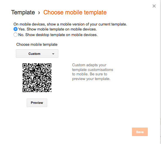
You most likely already have this function switched on but just in case you don't, go to template from your Blogger dashboard and then select the Mobile gear wheel. It will bring up this window, select Yes, show mobile template on mobile devices.

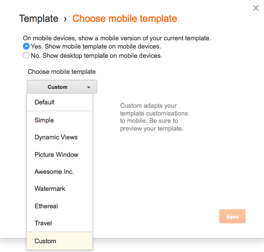
Before you hit save you can select your blog template rather than the default one. The default mobile template is grey and has none of your design features. It also adds padding to your photos, which I personally dislike - the border around your images. You can't carry everything over such as fonts but you can make it look more like your design.
In the same window open above, click on the drop down menu where is says choose mobile template and select the last one custom. Hit preview, if you're happy with how it looks then hit save.

An issue I find with Blogger mobile templates is that is doesn't include your widgets, you know the ones on your sidebar, so there's no where for you to follow someone on social media or send them a message. If I come across a blog I love, I always follow them on Bloglovin to keep up with their posts, which by the way you can for mine here!
WIDGETS
To include certain widgets on your mobile template, firstly go to your Blogger layout page and select the widget you want to include. In my case I've included my social media icons, search bar, follow by email and the Disqus comments system.
You need to find the widget tag ID, so to do that click on the widget you want to add first and click edit. This window should pop up, you want to look for the name of the tag at the very end of the address bar. For the search bar widget, the ID is HTML7.

Next, go to your template setting and edit HTML (please back up your template first!) In the main body of HTML text select cmd find and search for HTML7.
<b:widget id='HTML7' locked='false' title='' type='HTML'>
<b:includable id='main'>
<!-- only display title if it's non-empty -->
<b:if cond='data:title != ""'>
<h2 class='title'><data:title/></h2>
</b:if>
<div class='widget-content'>
<data:content/>
</div>
<b:include name='quickedit'/>
</b:includable>
</b:widget>
<b:includable id='main'>
<!-- only display title if it's non-empty -->
<b:if cond='data:title != ""'>
<h2 class='title'><data:title/></h2>
</b:if>
<div class='widget-content'>
<data:content/>
</div>
<b:include name='quickedit'/>
</b:includable>
</b:widget>
You then want to add this code: mobile='yes' inbetween locked='false' and title.
Click save and check out your page on your mobile. Your widget should be at the bottom of your mobile template. Do this to all the widgets you want to include. I find a super handy one is adding the Disqus widget as it makes it so easy for people to leave comments. The standard Blogger commenting doesn't always work on mobiles.
I hope you found this post useful, I know it's not applicable to all you guys but I wanted to help anyone who wanted to make their blog more mobile friendly on Blogger!
Do you read blogs on your desktop or mobile?
Worth a read: 5 Photo applications to make blogging easier.

Follow me on
